 Amongst the paraphernalia of Halloween currently proliferating in our shops - in addition to witches’ hats, devils’ pitchforks, vampire fangs and warty hag noses - are a whole range of masks that take their inspiration from the horror folk of literature: Count Dracula, Frankenstein’s Creature, the Hunchback of Notre Dame and Dr Jekyll and Mr Hyde: all of whom represent far more than the mere fear engendered by the genuinely terrifying and ruthlessly violent aspects of their various sagas.
Each of these characters is a symbol of some facet of the fears and phobias that assail the human imagination such as death and deformity and - in the case of those experimental doctors, Frankenstein and Jekyll - the potential threat of technology and science…
The warring psyches of Jekyll and Hyde as described by Robert Louis Stevenson, have never lost their fascination in the 120 years since the story was first published.
 It has been the subject of many films and television versions and a number of illustrators have attempted to capture the terror of Henry Jekyll’s struggles to control his murderous alter ego. An artist who succeeded with dramatic brilliance was Mervyn Peake, the subject of my recent blog, Peake District, and a fascinating new book Mervyn Peake: The Man and His Art.
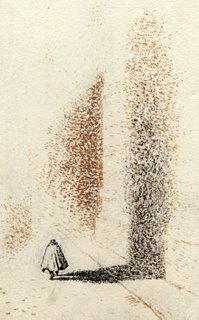
Peake illustrated Dr Jekyll and Mr Hyde for the Folio Society in 1948 with a suite of drawings that demonstrate that the artist clearly understood the need to resist the temptation to merely draw the monster that was the flip-side of the man.
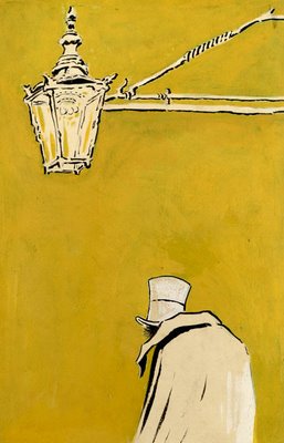
So, whilst he depicted the haunted Dr Henry Jekyll (above right) when it came to Mr Hyde, Peake chose only to hint at the horror, depicting him as scuttling off down alleyways (top left) dwarfed by the city he terrorizes yet, at the same time, casting a towering shadow; or - as shown in the book’s frontispiece - pausing beneath the guttering gas-lamp, the only indication of disease being the hunched shoulders and the unkempt demeanour.
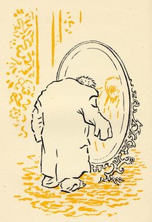 Peake’s economy of design and simplicity of line - almost Japanese in style - and his use of a disturbingly sickly-yellow wash is inspired as can be seen in the illustration of Hyde before the mirror (itself almost animal in form) considering his shrunken frame draped in Jekyll’s too-large clothing….
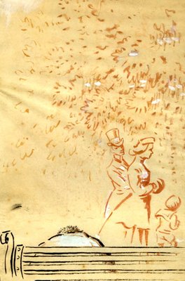
Or, again, in a cunningly contrived drawing of Hyde slumped on a park bench in which the full grotesqueness of his brutish depravity still remains hidden from us but is noted by the upright Victorian gentleman who gives a disturbed backward glance as he passes by with his wife and child…
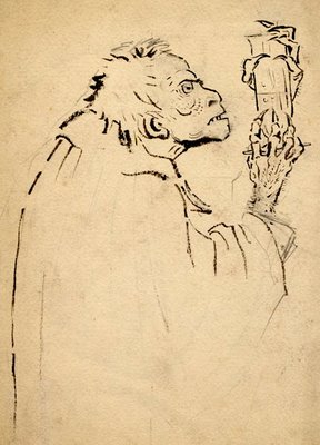
And so, when Mervyn Peake finally reveals Hyde to us in his bestial form - the simian features, the crab-clawed hand clutching the fateful, upraised phial - the effect is all the more terrible for our having waited for the revelation…
[All images: © The Mervyn Peake Estate]
3 comments:
WOW! Lucky you!! I remember seeing the ads for them (and the Dracula and Frankenstein's Monster kits!) on the back of comics...
The only Airfix people I had were totally NON-LUMINOUS types such as Henry VIII, Joan of Arc, Napoleon and the Black Prince...
Interesting post, I'm quite unfamiliar with Peake's ouvre as an illustrator. The book looks like one for the Xùas list. The sickly yellow pic with Hyde under the lamp is a masterclass in restraint.
Absolutely, Matt! If you haven't already done so, check out my earlier blog on Peake to see examples of his illustrations for 'Alice in Wonderland & Through the Looking-glass', 'Treasure Island' and 'Bleak House' - his penmanship is stunning and his eye for the bizarre is unequalled...
Post a Comment