
click image to enlarge
The auction house refers to this as a is a "landmark illustration" which is certainly true! A pirate edition of Rings was being published in the USA by Ace books and Ballatine were desperate to get the Tolkien 'authorised edition' on sale with all haste.
For the cover art they turned to Barbara Remington an artist, illustrator and designer who lived in New York's East Village and mixed in arty circles that included Timothy Leary, Allen Ginsberg, Robert Lowell and others. In 1965, she had provided the cover art for Ballantine's authorised US edition of The Hobbit...
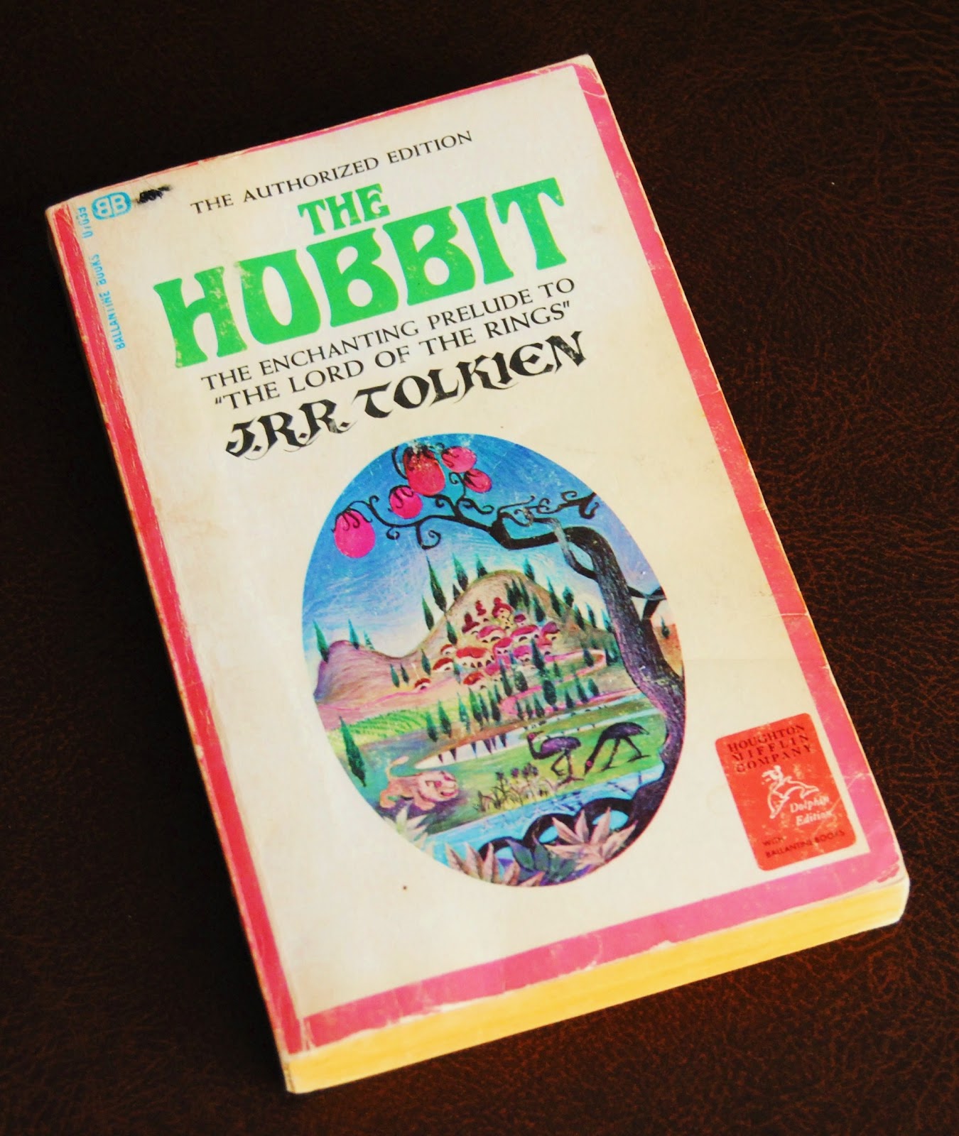
The design featured fanciful vignette of, presumably, Hobbiton along with a lion, two emus and a tree spouting pink bulbs....

Tolkien was not amused and wrote to Rayner Unwin at his publishing house, Geroge Allen and Unwin:
I think the cover is ugly; but I recognize that a main object of a paperback cover is to attract purchasers, and I suppose that you are better judges of what is attractive in USA than I am. I therefore will not enter into a debate about taste—(meaning though I did not say so: horrible colours and foul lettering)—but I must ask this about the vignette: what has it got to do with the story? Where is this place? Why a lion and emus? And what is the thing in the foreground with pink bulbs? I do not understand how anybody who had read the tale (I hope you are one) could think such a picture would please the author.Barbara Remington, in an interview many years later, explained these curiously worrying embellishments:
I worked for Ballantine, and as a practice, always read the books before doing the artwork. I didn’t have this luxury with the Tolkien Books, something I wish I could have changed. Ballantine was in a hurry to get these books out right away. When they commissioned me to do the artwork, I didn’t have the chance to see either book, though I tried to get a copy through my friends. So I didn’t know what they were about. I tried finding people that had read them, but the books were not readily available in the states, and so I had sketchy information at best... [Tolkien] was especially perplexed about the lion on the cover, because there are no lions in the story. He requested that Ballantine remove the lions from the cover, so they painted them over for later books.Although, as a sop to Tolkien, the lion was air-brushed out of Middle-earth for the 1966 reprint, the 'emus' survived and reappeared on the front cover of The Fellowship of the Rings when Ballantine rushed their authorised edition of The Lord of the Rings onto the US market. Once again, Remington had to design the covers without having an opportunity to read the book...
Ace books released an unauthorized edition of The Fellowship of the Ring, without Tolkien’s permission. There were some questionable copy laws that weren’t universally accepted. Ballantine bought the rights to the three books from Tolkien, and wanted to beat Ace before they had a chance to release the second two books of the series. So Ballantine authorized the release of all three books at once. This was unheard of. They came to me saying, 'We want you to draw all three cover pictures now.' And this was sight unseen... There wasn’t any time. They wanted them right away, and I had to draw all the covers at once...


click on images to enlarge
The covers reproduced above are from the collection of Oronzo Cilli, visit his blog: Tolkieniano.Collection and follow him on Facebook.
Regarding the Rings covers, Barbara Remington recollects:
Nobody was aware of ... the magnitude of these books, or the impact they would have... I’ve done many fantasy covers, and always read the books first... If I’d had the time to actuallyread the books first, which was my habit to do, I’d have definitely drawn different pictures. I’m a big Tolkien fan, and love these books, having read them many times... After reading his work, I was in awe of Tolkien. I knew there was something special about him. If I [had] read The Lord of the Rings first, I don’t think I could have drawn the cover art... I’d have felt intimidated. These books were so special, I would have perhaps felt overwhelmed.As the piece now up for auction shows, Remington's cover designs for the three Rings volumes was made as single piece of art – so that the published books could be laid side-by-side to form a single landscape. Indeed, Ballantine used the entire image as a wrap-around slip-case design for the boxed set...

click on images to enlarge
A hugely popular poster, titled 'Wilderness', was also produced using this accidentally iconic image!
Avid Tolkien collectors should note that Heritage Auctions' estimate is a mere $20,000-$30,000.
3 comments:
First copy I got from my brother Christmass 2966. LATER Igot the Huge Poster of the whole painting. WHICH I had on my bedroom Wall. Where it Went I don't Know?
There was also the first edition of Understanding Tolkien by William Ready which had cover art very reminiscent of Remington.
I need to re-read the Tolkien LORD OF THE RINGS trilogy again! Based on Tolkien's letter of disapproval to Allen and Unwin; I find Tolkien's idea of 'taste' pretty fascinating. I've read several of Tolkien's letters, where he despises the work of Walt Disney, which he claims to find 'nauseating'. I suppose he has his reasons, as he felt fairy tale stories weren't simple tales for children.
Off-hand, I was particularly intrigued by C.S. Lewis' comment on Walt upon Snow White's release, "What might not have come of it if this man had been educated-- or even brought up in a decent society?". It strikes me as snobbery there...
Hope you are well, Brian, and I apologise if I've been neglectful in the blog-sphere these days!
Post a Comment