Saturday 29 April 2017

MR DOCTOR WILL SEE YOU NOW...

Who knew (if you'll pardon the pun) that there would ever be a series of MR. MEN books that would sell to grown-ups who weren't buying them for their kids? But here they come...


Created by Adam Hargreaves in the style of his dad's famous books, these are the first of the DR. books. Of course, Who-purists will remind me that it should be 'Doctor' not 'Dr.' but that's just because Roger Hargreaves' creations were 'Mr.' not 'Mister'.

I won't pretend that I've been a constant fan and devoted follower of Doctor Who throughout his 54 year-long regeneration process, but I've always checked out each new incarnation of the Doctor if, for no other reason, because of a sentimental attachment to my youthful memories of where it all began...

To be honest, I've never quite got over the fact that I missed the very first appearance of Doctor Who on our black and white telly or the fact that, whenever I mention this, David reminds me that he was watching!

It was teatime – 5:15 in the afternoon of 23 November 1963 (the day after the assassination in Dallas of President John F Kennedy) - when the BBC transmitted episode one of 'An Unearthly Child' with William Hartnell as the enigmatic Doctor.


Come Monday morning, everyone at school was talking about this amazing new TV show about a Time Lord zapping through time and space in a machine called a TARDIS that was disguised as a then commonplace piece of British street furniture – a police telephone box.

The following Saturday, I was on the sofa (I was already too old to be hiding behind it!) ready to watch the next episode and – wonder of wonders! – in response to a phenomenal public reaction to the series' debut and the fact that other hapless youngsters had also missed the beginning, the BBC preceded the second episode with a repeat of the first! Brilliant! I was hooked...

It's a truism (but true for all that!) that everyone's favourite Doctor is the one they watched when they were growing up. For me it was first and foremost, the irascible, grandfatherly William Hartnell and here's proof of my devotion...

The First Doctor

I also still remember when the cantankerous Hartnell transmogrified into the quirkily eccentric Patrick Troughton and how utterly, fantastically exciting was that first regeneration

Here's the fan picture I wrote for at the time...

Ther Second Doctor

And now – what fun! – Dr. Second is going to look like this...


As they used to say on those pre-health-and-safety cereal packets containing giveaway toys ––– er... sorry... I mean chocking hazards –––  "BE SURE TO COLLECT THE FULL SET!"


Monday 24 April 2017

WRITE-LIGHTS

As any regular reader of this blog will testify, there can be few more dedicated devotees of the late Ray Bradbury than I. We were friends for 30 years and I have several binders filled with his correspondence and a huge collection of his books, but even my reverence has its limits....

RAY BRADBURY SAINTED WRITERS PRAYER CANDLE

“You must stay drunk on writing so reality cannot destroy you."Ray Bradbury 

When you're ready to get and stay drunk on writing, seek blessings from Saint Ray.

Your candle will feature the “sainted” writer’s image on the front, and a prayer or other message on the back. Currently available prayers:
✑ prayer for essay writers
✑ prayer for readers
✑ prayer for creative writers
✑ prayer for prelims exam success
✑ prayer for dissertation writers 
✑ prayer for thesis writers
The top of your candle will be tied with a ribbon and a charm that's related to writing, the writer's work, and/or the prayer you’ve chosen, usually a pen nib or book.

Candles are made from hand-poured, unscented, non-GMO soy wax. The wicks have cotton cores. They are approximately 8.5” tall and 2.5” in diameter. Each can burn for up to eighty hours depending on the environment. Safety instructions are included. 

£12.14 plus shipping  

Note: Sainted Writers candles are not official merchandise of the authors or publishers. I seek trademark- and copyright-free elements for every design. 

There are lots of sainted writers awaiting your petitions including Tolkien and Rowling...


You can view the entire company of saints (from Douglas Adams to Jeanette Winterson) here

Tuesday 18 April 2017

HOBBITS AND LIONS AND EMUS, OH MY!

An historic piece of Tolkien-related artwork goes under the hammer in a couple of days: Barbara Remington's original cover design for the 1965 Ballantine three-volume, authorised American paperback edition of The Lord of the Rings. 

click image to enlarge

The auction house refers to this as a is a "landmark illustration" which is certainly true! A pirate edition of Rings was being published in the USA by Ace books and Ballatine were desperate to get the Tolkien 'authorised edition' on sale with all haste. 

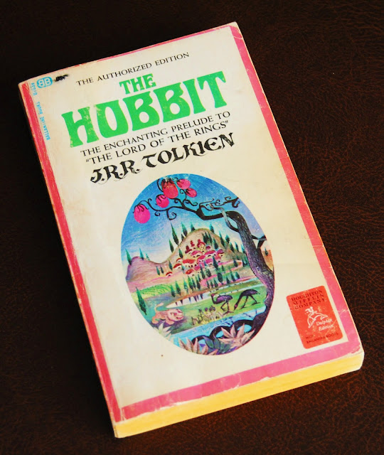
For the cover art they turned to Barbara Remington an artist, illustrator and designer who lived in New York's East Village and mixed in arty circles that included Timothy Leary, Allen Ginsberg, Robert Lowell and others. In 1965, she had provided the cover art for Ballantine's authorised US edition of The Hobbit... 


The design featured fanciful vignette of, presumably, Hobbiton along with a lion, two emus and a tree spouting pink bulbs.... 


Tolkien was not amused and wrote to Rayner Unwin at his publishing house, Geroge Allen and Unwin:
I think the cover is ugly; but I recognize that a main object of a paperback cover is to attract purchasers, and I suppose that you are better judges of what is attractive in USA than I am. I therefore will not enter into a debate about taste—(meaning though I did not say so: horrible colours and foul lettering)—but I must ask this about the vignette: what has it got to do with the story? Where is this place? Why a lion and emus? And what is the thing in the foreground with pink bulbs? I do not understand how anybody who had read the tale (I hope you are one) could think such a picture would please the author. 
Barbara Remington, in an interview many years later, explained these curiously worrying embellishments: 
I worked for Ballantine, and as a practice, always read the books before doing the artwork. I didn’t have this luxury with the Tolkien Books, something I wish I could have changed. Ballantine was in a hurry to get these books out right away. When they commissioned me to do the artwork, I didn’t have the chance to see either book, though I tried to get a copy through my friends. So I didn’t know what they were about. I tried finding people that had read them, but the books were not readily available in the states, and so I had sketchy information at best... [Tolkien] was especially perplexed about the lion on the cover, because there are no lions in the story. He requested that Ballantine remove the lions from the cover, so they painted them over for later books.
Although, as a sop to Tolkien, the lion was air-brushed out of Middle-earth for the 1966 reprint, the 'emus' survived and reappeared on the front cover of The Fellowship of the Rings when Ballantine rushed their authorised edition of The Lord of the Rings onto the US market. Once again, Remington had to design the covers without having an opportunity to read the book... 
Ace books released an unauthorized edition of The Fellowship of the Ring, without Tolkien’s permission. There were some questionable copy laws that weren’t universally accepted. Ballantine bought the rights to the three books from Tolkien, and wanted to beat Ace before they had a chance to release the second two books of the series. So Ballantine authorized the release of all three books at once. This was unheard of. They came to me saying, 'We want you to draw all three cover pictures now.' And this was sight unseen... There wasn’t any time. They wanted them right away, and I had to draw all the covers at once...


click on images to enlarge

The covers reproduced above are from the collection of Oronzo Cilli, visit his blog: Tolkieniano.Collection and follow him on Facebook.

Regarding the Rings covers, Barbara Remington recollects:
Nobody was aware of ... the magnitude of these books, or the impact they would have... I’ve done many fantasy covers, and always read the books first...  If I’d had the time to actuallyread the books first, which was my habit to do, I’d have definitely drawn different pictures. I’m a big Tolkien fan, and love these books, having read them many times... After reading his work, I was in awe of Tolkien. I knew there was something special about him. If I [had] read The Lord of the Rings first, I don’t think I could have drawn the cover art... I’d have felt intimidated. These books were so special, I would have perhaps felt overwhelmed.
As the piece now up for auction shows, Remington's cover designs for the three Rings volumes was made as single piece of art – so that the published books could be laid side-by-side to form a single landscape. Indeed, Ballantine used the entire image as a wrap-around slip-case design for the boxed set... 

click on images to enlarge

A hugely popular poster, titled 'Wilderness', was also produced using this accidentally iconic image!

Avid Tolkien collectors should note that Heritage Auctions' estimate is a mere $20,000-$30,000.  

Sunday 16 April 2017

EASTER IN MOOMINLAND

Charming vintage (1940s) Easter paintings by Tove Jansson...


Visit the official Moomin website

EASTER LIGHT


[Photo: Brian Sibley]

Friday 14 April 2017

Good Friday


[The Kelham Rood in St John the Divine, Kennington. Photo: Brian Sibley]

Thursday 13 April 2017

FORTUNE COOKIE SAY...


Now, that is... er... well... profound...

INCONVENIENCED

I'm a big fan of Tate Britain, but their disabled loos are the most inconvenient conveniences I have ever used, BECAUSE...


...it is impossible to use the loo without triggering the hand dryer which remains at full throttle for the duration, reaching incendiary levels of heat whilst blowing the loo-paper out of reach.

Having been built to accommodate a wheelchair, there are acres of wall space that could have been used to mount the dryer other than right above where you sit!


Wednesday 5 April 2017

SCARFE-FACED

A memorable day, yesterday, with David and I being invited to lunch at Sotheby's auction house in London to celebrate the sale (today) of an astonishing array of cartoons, caricatures and drawings....


The unmistakable work of the (truly) legendary artist and satirist, Gerald Scarfe...

Photo: David Weeks

We were in celebrated company: in addition to Gerald, his wife, Jane Asher, and their son, Frederick, there were – among others – Felicity Dahl (widow of Roald) and Donald Sturrock (Dahl's biographer) and sitting next to David (to his great delight) Nick Mason of Pink Floyd!

The sale features a staggering range of Scarfe's work including many delicious inky assassinations. Here are Thatcher, Blair and Obama...


A sardonic future-vision: Prince William, leapfrogging his father, Prince Charles to seize the crown...


A clutch of Showbizers: Mick Jagger, Julie Andrews (in Mary Poppins), Nigel Hawthorne (in Yes, Minister) and Ian McKellen...


Also for sale are examples of Gerald Scarfe work for the theatre: McHeath in The Beggar's Opera and a costume designs for Drosselmeyer in the ballet, The Nutcracker and for the title-character of the operatic version of Roald Dahl's The Fantastic Mr Fox...


And, of course, Scarfe's work on two memorable – vastly different – film projects: Pink Floyd  – The Wall and Disney's Hercules...


On a wall by itself in the pre-sale exhibition (and in a class-act all of its own) hung one of Gerald Scarfe's most celebrated – and, at the time, notorious – portraits.

In 1964, The Times commissioned the artist to mark Winston Churchill's final day in the House of Commons, but the submitted picture was deemed too controversial to publish. 

The drawings is an extraordinary piece of work: the pathetic, decaying, sunken-eyed Churchill dominates the meticulously drawn architectural setting with Conservative politicians (including Reginald Maudling and Alec Douglas-Home) peeping out from behind his hunched bulk and the Speaker of the Commons, Sir Harry Hylton-Foster, lurking in the shadowy recess of the Speaker's Chair.


Six months later, when Churchill died, Peter Cook used the drawing on the cover of the satiric magazine, Private Eye... 


Bidding opens on this piece of British national (and cartoon) history at £100,000...

Saturday 1 April 2017

THE TELLER OF TALES

One of my favourite contemporary illustrators, Michael Foreman, is the subject of a major retrospective selling exhibition at Chris Beetles Gallery, London.  


Telling Tales will be on show from 5-22 April and features Foreman's radiant artwork for some of the greatest classics of childhood: Treasure Island, Alice in Wonderland, Peter Pan and Wendy, A Child's Garden of Verse, The Wizard of Oz, a pre-Quentin Blake interpretation of Charlie and the Chocolate Factory and examples of the artist's illustrations for books by Terry Jones.


The hallmarks of Foreman's work are a quality of dynamic energy, a singularity of perspective and his skill at creating enchanting visions of the fantastic with a subtlety of line and a colour palette of transcendent luminosity...


The exhibition is accompanied by a fabulous, 140-page, illustrated catalogue (£15 + p&p) containing over 260 full-colour reproductions.


Chris Beetles Gallery can be found at
8 & 10 Ryder Street, St James's, London SW1Y 6QB
Open: Monday-Saturday 10:00-17:30
Tel: 0207839 7551 email: gallery@chris Beetles.com