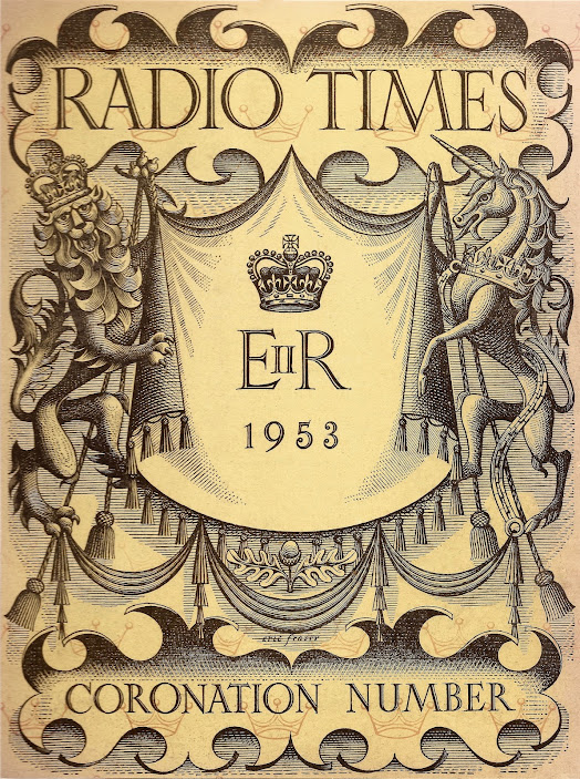
In 1953, the BBC's official magazine, Radio Times, marked the Coronation of Queen Elizabeth II with an ornately-decorated cover by Eric Fraser, one of Great Masters of line illustration and a regular contributor to the pages of Radio Times, specializing in creating arresting illustrations for audio broadcasts among them productions of Shakespeare's plays, poetry, religious and philosophical topics as well many of the world's most celebrated classics – including towards the end of his career, the BBC's 1981 dramatisation of The Lord of the Rings.
Eric Fraser's cover for the Queen's Coronation features traditional heraldic imagery and is a masterpiece of elegant design...
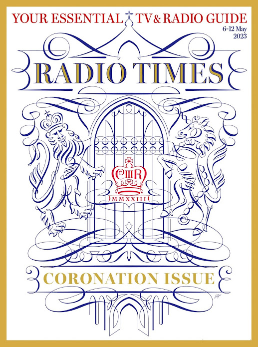
Seventy years on, the current issue of Radio Times marks the Coronation of King Charles III with a design by Peter Horridge clearly is an homage to Fraser in that he uses the same heraldic beasts but which, nevertheless, is much planer, although equally elegant.
Peter is a designer and illustrator with a great gift for calligraphy and calligraphic design. To my mind, this image, with its lightness and airiness, manages to sensitively unite the archaic traditions of ceremonial with the King's desire to be viewed as a 'modern monarch'. The incorporation of a window and, below, arches suggests the venue for the Coronation, Westminster Abbey...
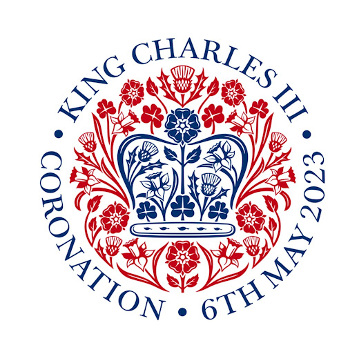
Peter Horridge was also responsible for the rather more formalized image (well, actually, a logo) created as a symbol of the Coronation as a participant in the creative collective of Sir Jony Ive's LoveFrom, [Note: One word, two caps and a terminal comma].
This was one of several Royal commissions, others include the seal of Terra Carta launched by the former Prince of Wales at COP26 in 2021 as a mandate that puts sustainability at the heart of the private sector.


No comments:
Post a Comment